29/12/2014

My name is Gladiator

Well, not quite ;-)

We play Blood on the Sands occasionally which is very good gladitorial rules set being developed by Furt over on the LAF but there is still some work to do on them.

As a consequence, a fair amount of matches were posted on the LAF and I got asked to make an arena for a chap in America.

Circular in shape with a removable audience balcony. The floor was lasered and then sanded, coloured and had hex edges lightly sprayed though a template.


The walls were two layers of card with a circular structure on the inside to give it the shape and then some coping stones in the form of lasered acrylic were placed on top. The wall decoration on the inside was laser card stuck in place.

Painting was fairly simple. The whole lot was given a coat of textured masonry paint and then painted in a warm cream, this was then washed with a reddy brown ink, left to dry and then drybrushed up to almost white.

The red was masked out and painted on, taking care not to flood the area and get paint under the masking.

The audience balcony was a simple structure made from various parts I had lying around, the same goes for both doors.

I added a couple of paulus as well which were training posts or could be used in a match if spikes were added to them (the gladiators trying to push each other on to them).

I'll leave you now with a few pictures of the finished piece.


ttfn

28/12/2014

Ghost market

Got asked to make these a while ago but I seem to be on a run of posting old jobs and you seem to be enjoying them so why not :-)

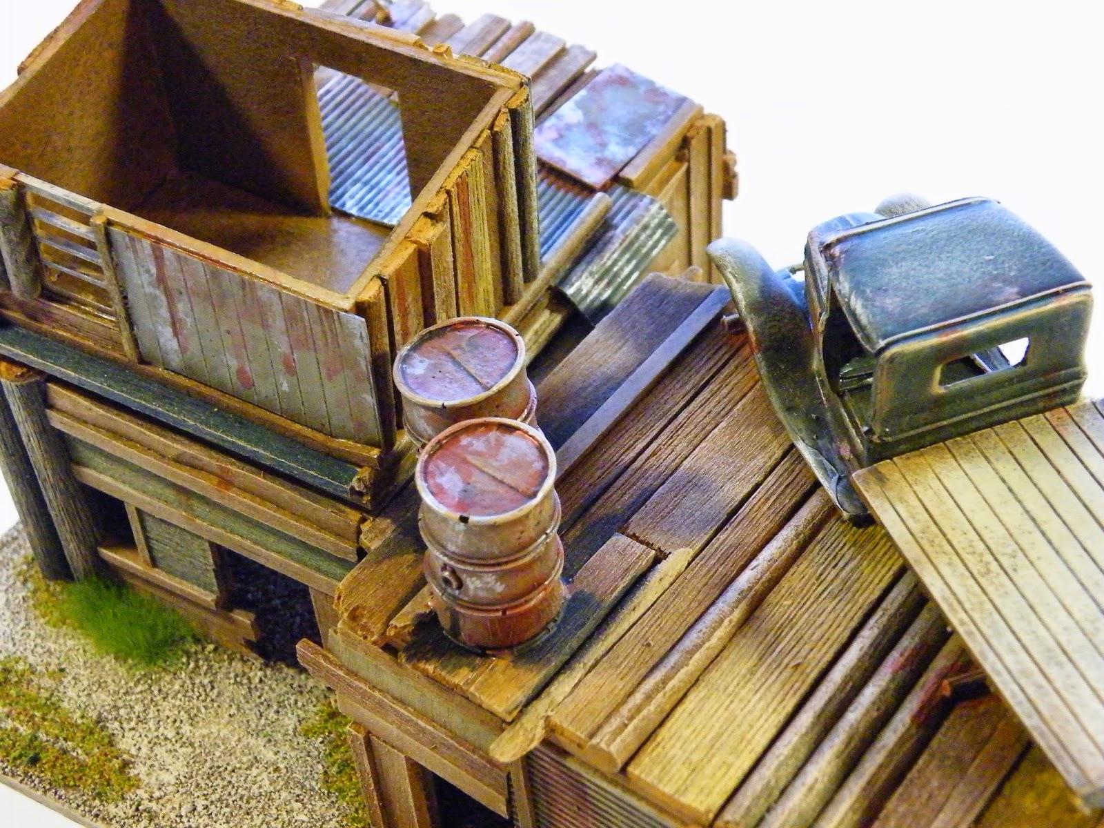
These had to be kept fairly modular so the buildings take the same size and the roofs/upper floors are swappable .

Simple card construction for the structure and then a whole lot of time was spent on cladding, trying to make the walls as different as possible... Not an easy task.


Not too many work in progress photos (or finished ones for that matter) but here are a couple more of progress. They were all given a spray coat of a light brown and ten as many panels/parts as possible were 'coloured in', then a liberal wash of varying shades of brown ink and then different parts were brought up with lots of drybrushing tones.


 ttfn


25/12/2014

A quick festive message

Best Wishes for the Season and for 2015 and thank you al for the views, comments, follows etc.

Next year will be bringing, I hope, some interesting and exciting projects that I'll share with you all.

ttfn

22/12/2014

The Bishops Seminary

Some of you might have seen this in the recent issues of Miniature Wargames and now the articles have been published I can show the build process involved and some of the finished photos. There is also a link to Jonathans excellent blog below and some of the pictures he took and has kindly let me use.

http://jjwargames.blogspot.co.uk/

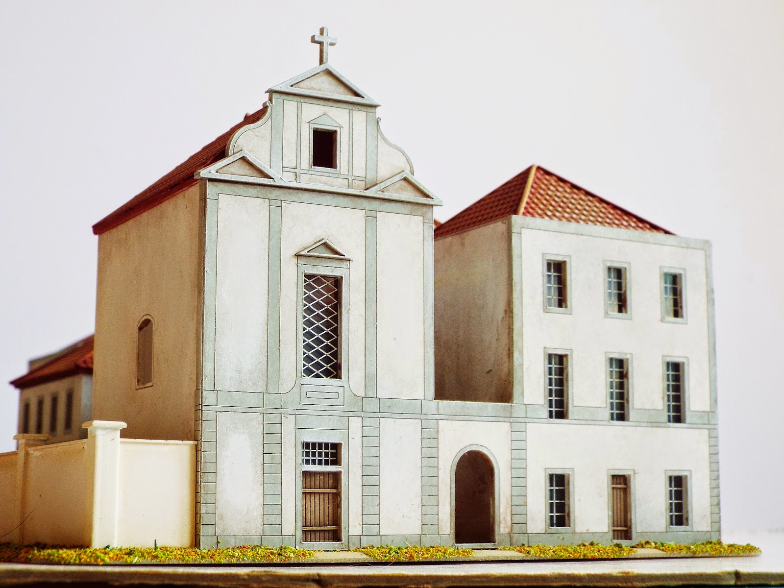
I was asked by Jonathan Jones to make a model of the Bishops Seminary in Oporto for his Peninsular campaign and was given a rough size and drawing to work from. I did have to change the initial information a little bit as I'm not very good at approximating and so got as many views of the building as possible. It was mainly a case of adding to the frequency of the windows and slightly increasing the length.

I decided to tackle this as an architectural model more than a wargaming one due to the size and regularity of the windows and main features.


All the elevations were drawn up in cad first and then assembled around a ground and roof plate.The whole lot was sprayed white and then the window frames and architectural details were sprayed grey. the whole lot was then given a light wash of ink to show the details better.


The windows themselves were scored onto a mid-grey backsprayed bit of acrylic and then they had paint rubbed in them to show the mullions and transoms.


The roof was made first as a subframe in card and then styrene pantiles sheeting was applied on top of this. After spraying red and a quick wash of brown ink, they were given a couple of drybrushes of of increasingly lighter orange.


For the garden there wasn't any information that I could find and the existing site has quite a few new buildings and a small football pitch now so I had to have a look at some generic Spanish and Portuguese formal gardens and go from there. It seemed to work and I kept it quite simple.


I'll leave you with some shots of the finished model.


Here are the pictures that Jonathan passed on to me.


ttfn